Is Illustration Art?
Illustration and Realism
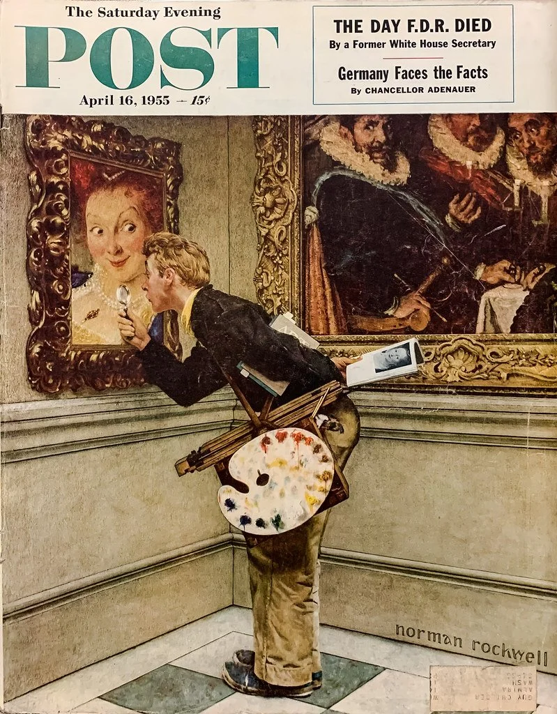
Illustration by Norman Rockwell
I was inspired to be an illustrator when I saw the illustrations by Norman Rockwell when I was a child. His paintings told stories, about holidays, everyday moments, growing up, celebrating those moments that slip by so fast but yet remain in our memories tucked away like old photographs. He celebrated these moments in his beautifully executed paintings, rendered with oil on canvas in his hyper realistic manner. In reading his biographies I learned that he was very much aware of the modern art movement that was all around him. How could he not be? At one point in his career he did try to work in a more abstract method, but the results were not satisfying to him, because it just wasn’t who he was as a creator. After all, we do need to be true to ourselves as artists/illustrators, don’t we?
When I first went to art school at Pratt Institute in Brooklyn, NY I was introduced to a way of looking at and creating art, but in retrospect I don’t think I was mature enough to understand what I was being taught. I was in the graphic design/commercial art department which didn’t dwell too much on fine art conceptual thinking, although it was an influence nevertheless. There was one student in my classes who could paint like Norman Rockwell! As a teenager he had studied with an artist who taught him the techniques of realistic painting. Everyone in class was astounded at how well he could paint, because it looked so REAL! But what was perplexing was the reaction of the professors to his work, which was either completely negative or dismissive! I remember his crestfallen face when he received these critiques because he had thought, mistakenly, that his art would receive praise! At 19, he was trained in a realistic technique that was not easy to master, but little did he know that many art schools didn’t value the techniques of the old masters.
Painting by Johannes Vermeer
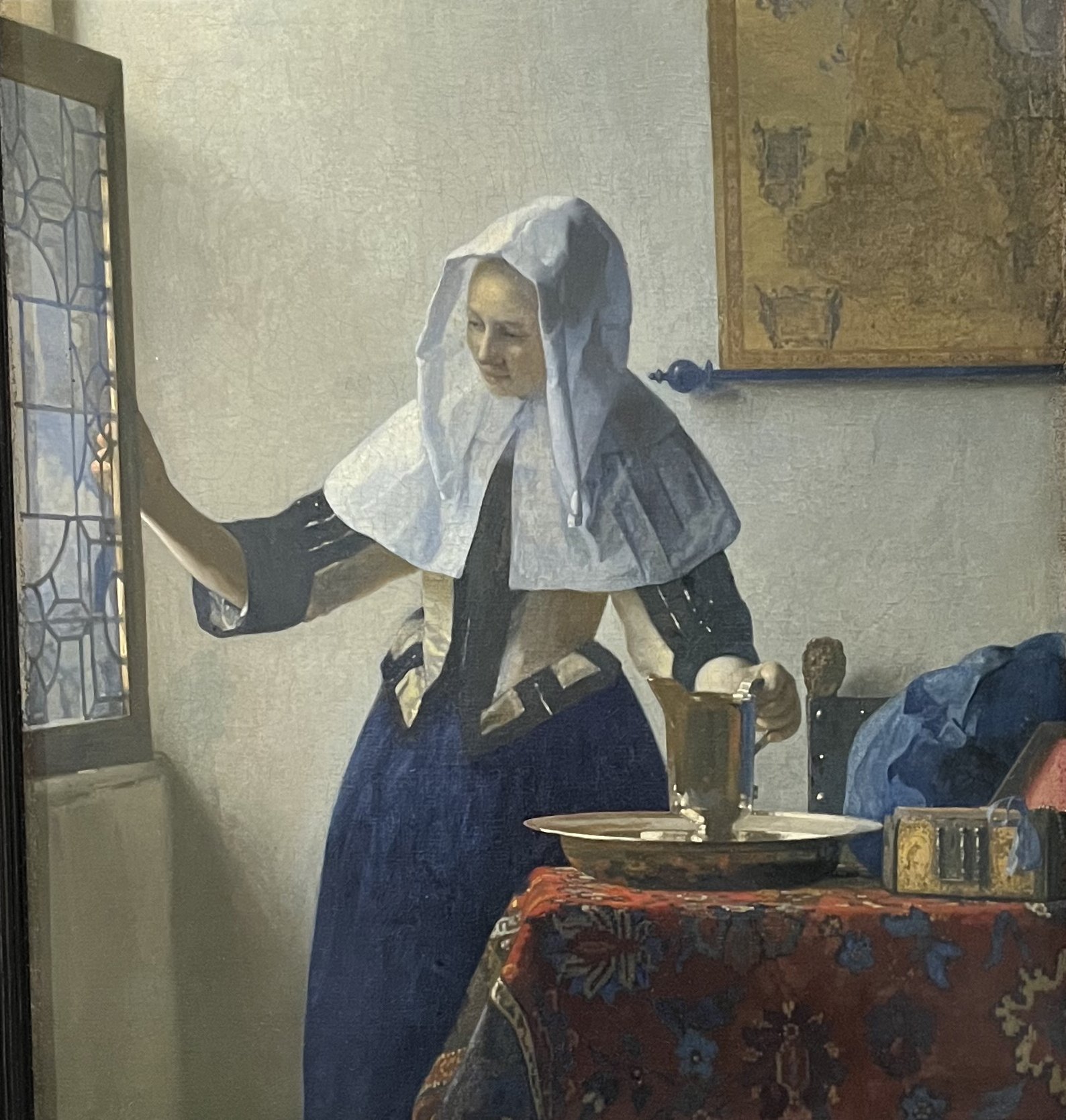
It wasn’t until I began work on my MFA (Master of Fine Art) that I began to understand what caused this attitude towards illustration and realism. As art moved into the 20th century (putting on my professorial robes now), artistic expression moved from the realistic modes of the previous centuries into modernism, which resulted in abstraction. Putting it simply, as artists moved from Impressionism, to abstraction, eventually the recognizable image in art disappeared as part of a natural evolution of artistic expression. So, the art schools reflected that evolution in their teaching methods. The art of the 19th century was called “mimetic”, which describes a process of creating an image that looks like what we see in the world. It’s recognizable to everyone, even non-artists. And for most of the academic art world, it was the art of the past. Required reading in art history classes was an essay by Clement Greenberg, called “Avant-Garde & Kitsch” which basically criticized commercialism in the art world, using Norman Rockwell as a poster boy for what he thought of as being a low form of art. He used the word kitsch to describe art that catered to popular tastes amongst the masses, and sought to elevate artists like Jackson Pollack and Willem DeKooning as forms of “high art” that were more worthy of admiration. These artists are certainly worthy of admiration and were important in the history of art at mid-century.

Painting by Jackson Pollock

Painting by Willem De Kooning
I learned so much from working for my MFA, which is a degree that I needed to teach college level courses. I now understand why those professors from way back in my time at Pratt turned their noses up at the realism of my fellow student. After presenting my work in classes, a few fellow students in the MFA program asked me, “don’t you ever have the desire to work abstractly?” I was initially taken aback, then I responded by saying that I believe all works of art contain abstract elements in composition, colors, basic graphic elements, formal qualities that make up all works of 2- dimensional art. I don’t think that they understood that abstraction was being used to express a different artistic feeling. Pollack, DeKooning and Mark Rothko were using non-representational imagery to express themselves as artists, with one difference being that they were not telling a specific story, because it wasn’t about the narrative for them. There was a story behind each work of art, but the artist also left it up to the viewer to interpret it in their own way.

Painting by Mark Rothko
This is when I had my epiphany, not of major proportions, but I now understand what purpose realism and illustration serves in the world of art. In a very general sense, the fine art of the 20th century, to the present day has been about self-expression which often has abstract qualities, which do not necessarily tell a specific story. This brings me back to thoughts about Norman Rockwell, his realism, and his illustrations. It now made sense that the anti critics scoffed at Rockwell’s work because he was an illustrator who told stories through his paintings, and a realist to boot! I won’t go into this in detail now, but being an illustrator in academia has been complicated at best. Because illustration has been scorned as a legitimate “artistic” pursuit, many if not most departments have not had it as a main part of their curriculum. But this has been changing.

Painting by Norman Rockwell
The pendulum in the art world, like in most worlds, swings back and forth. There have been major retrospectives in museums for artists like Rockwell, Edward Hopper and Andrew Wyeth, all realists. Wyeth is a good example of an amazing artist who had been spurned by almost all art academics for many years, which is interesting because he wasn’t an illustrator but was employing a medium and realistic style that was seen as a relic of the past. I remember seeing his famous painting “Christina’s World” at MoMA in NYC, positioned right outside the women’s rest room! And I thought to myself, are they making a statement here, or was it just an unfortunate positioning?I’m not sure where it is now, but I tried to put these thoughts out of my mind.

Painting by Andrew Wyeth “Christina’s World”

Painting by Edward Hopper
I believe that the art world of today embraces a more eclectic vision of what art is. I see this reflected in the art program where I have been an instructor for over 20 years because students have requested my mentorship to express themselves in areas where the narrative is important. Young people are interested in graphic novels, video games and animation where the image is used to tell a story. Some colleges have created departments to fulfill the need that students have to express themselves through their own creation stories. So, is this fine art?? Is this illustration? Is this kitsch? Does it even matter as long as we are free to create what is inside ourselves as artists.
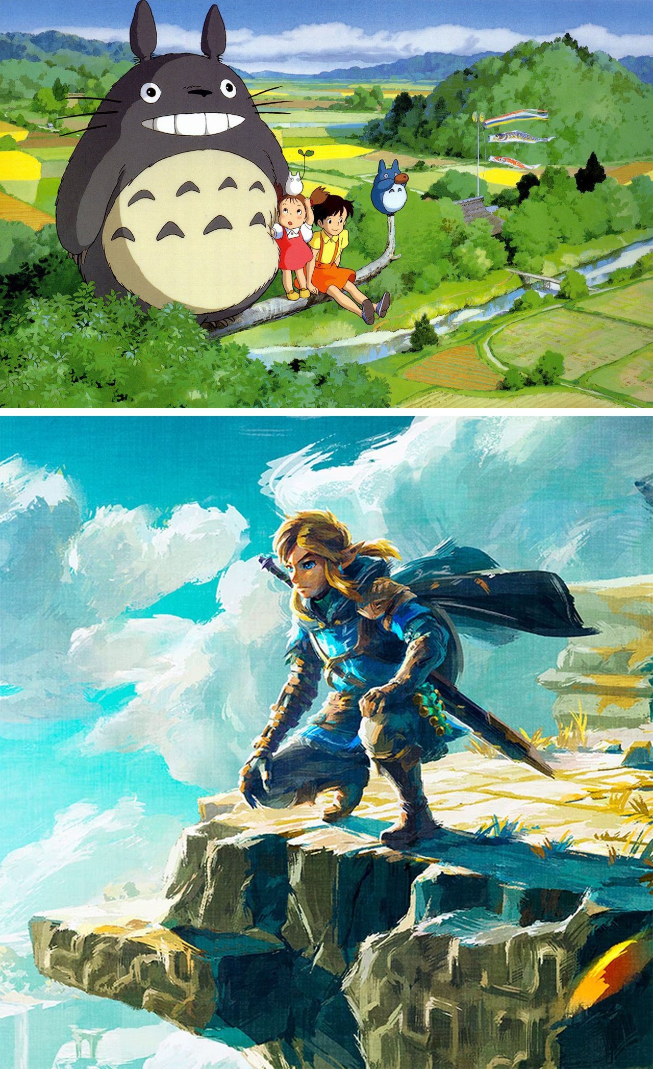
Top image: from the movie “My Neighbor Totoro” directed by Hayao Miyazaki
Bottom: Image from Image from “The Legend of Zelda: Tears of the Kingdom” Nintendo video game
Down the Rabbit Hole
How stories can transport a reader to a world of pure imagination

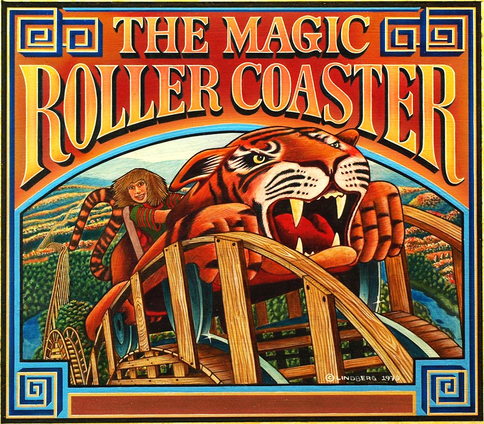
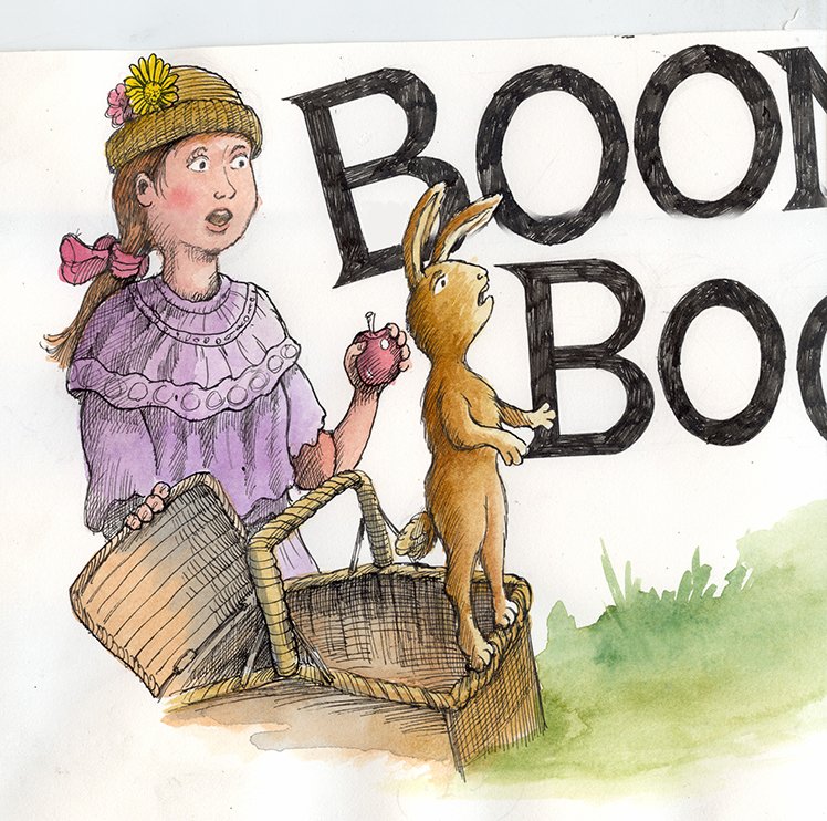
Fred Thompson meets Millie & Selena. Illustration ©Jeffrey Lindberg from “Coney - a Trip to Luna Park.”
I love fantasy stories. Tales like the “The Wonderful Wizard of Oz” or “Through the Looking-Glass”, which would transport me to a place of pure imagination. Yes, that is a quote from another famous fantasy story, “Charlie and the Chocolate Factory”, although the “pure imagination” words are from the original movie song. I don’t remember if those exact words are in the book by Roald Dahl, but the intent is the same. Most of these stories start out in an every day setting, a farmhouse in Kansas, an English garden or a normal city filled with average people.

Willie Wonka (Gene Wilder) in the tunnel that his took his visitors deeper into the candy factory.
But how do we travel to another world? Whether it’s the moon, deep under the sea or a place that only exists over the rainbow, there has to be a conveyance. A way to get there. Alice simply follows a white rabbit and falls down a rabbit hole! Or she walks right through the mirror and encounters an inverted world. Dorothy gets swept up by a hurricane, house and all, and crash lands in Oz. Charlie needed to find the golden ticket, a special invitation for the select few lucky children! Then Willie Wonka provided the magic, which was a world of his own inventions.

Left: Illustration for “Through the Looking-Glass” Lewis Carroll Illustration by John Tenniel
Right: For “The Wonderful Wizard of Oz” L. Frank Baum. Illustration by W.W. Denslow
I have worked for many years as an illustrator creating images for book covers. But I always wanted to write an original story, to illustrate a book that was my own creation.
I created this illustration a while ago, partly to develop new rendering techniques, but also to depict a concept that I had in my head for a fantasy story. Although I didn’t realize it then, this image began my journey that led to my creating “Coney - A Trip to Luna Park.”
Illustration © Jeffrey Lindberg Acrylic, airbrush and oils on masonite board
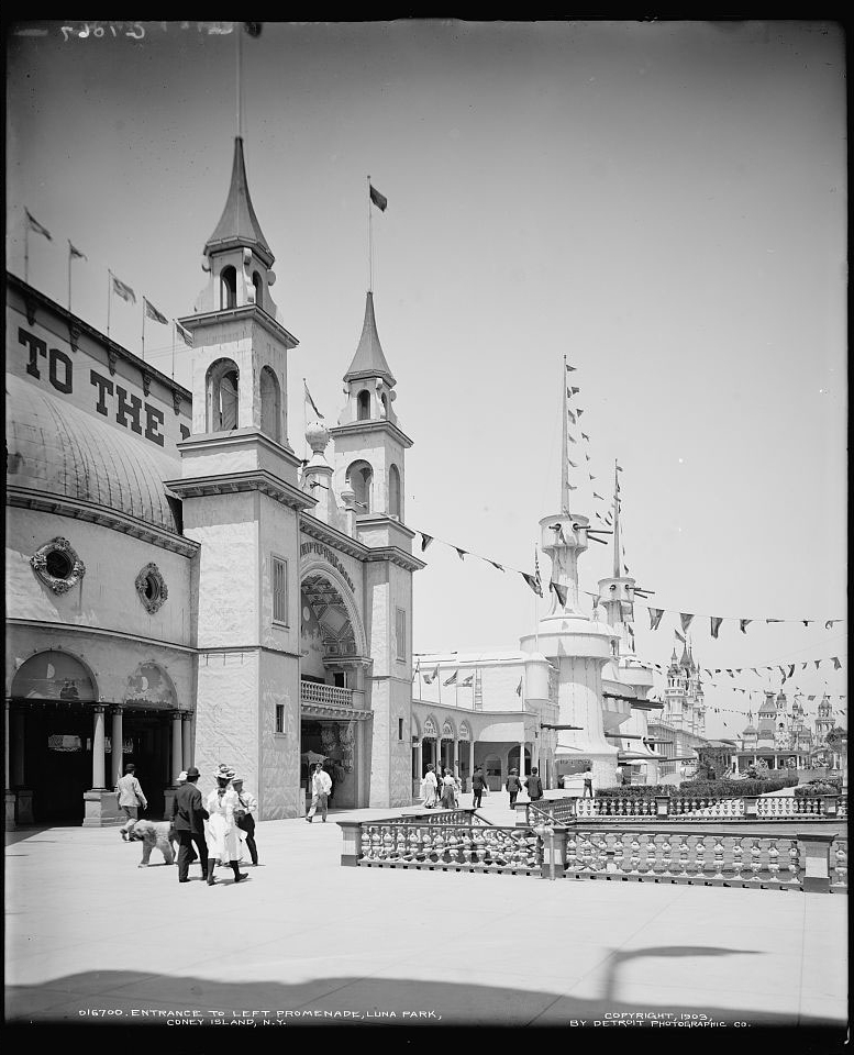
So how can we transport to another place? Since cyclones, rabbit holes and golden tickets have already been used I needed another “vehicle.” I then remembered my fascination with fairground architecture. The design aesthetic that makes up the visual fantasy of fairgrounds and amusement parks had always fascinated me. I thought of roller coasters. Dark rides taking us through twisting corridors. I started researching amusement parks and I realized the place where it all began… Coney Island!

Fred Thompson, creator and designer of Luna Park, Coney Island ca. 1903. I love to see him surrounded by what look to be concept sketches and artwork.
I learned that the architect and creator for Luna Park in Coney Island in 1904 was Fred Thompson. He had a vision for a new park that would appeal to the child in both adults and children. Fred Thompson used the expression the “little cellar door” of childhood, which is a metaphor for a dark place where someone would be thrilled and excited. He designed his rides like the “Trip to the Moon” to generate that thrill of flying into outer space.
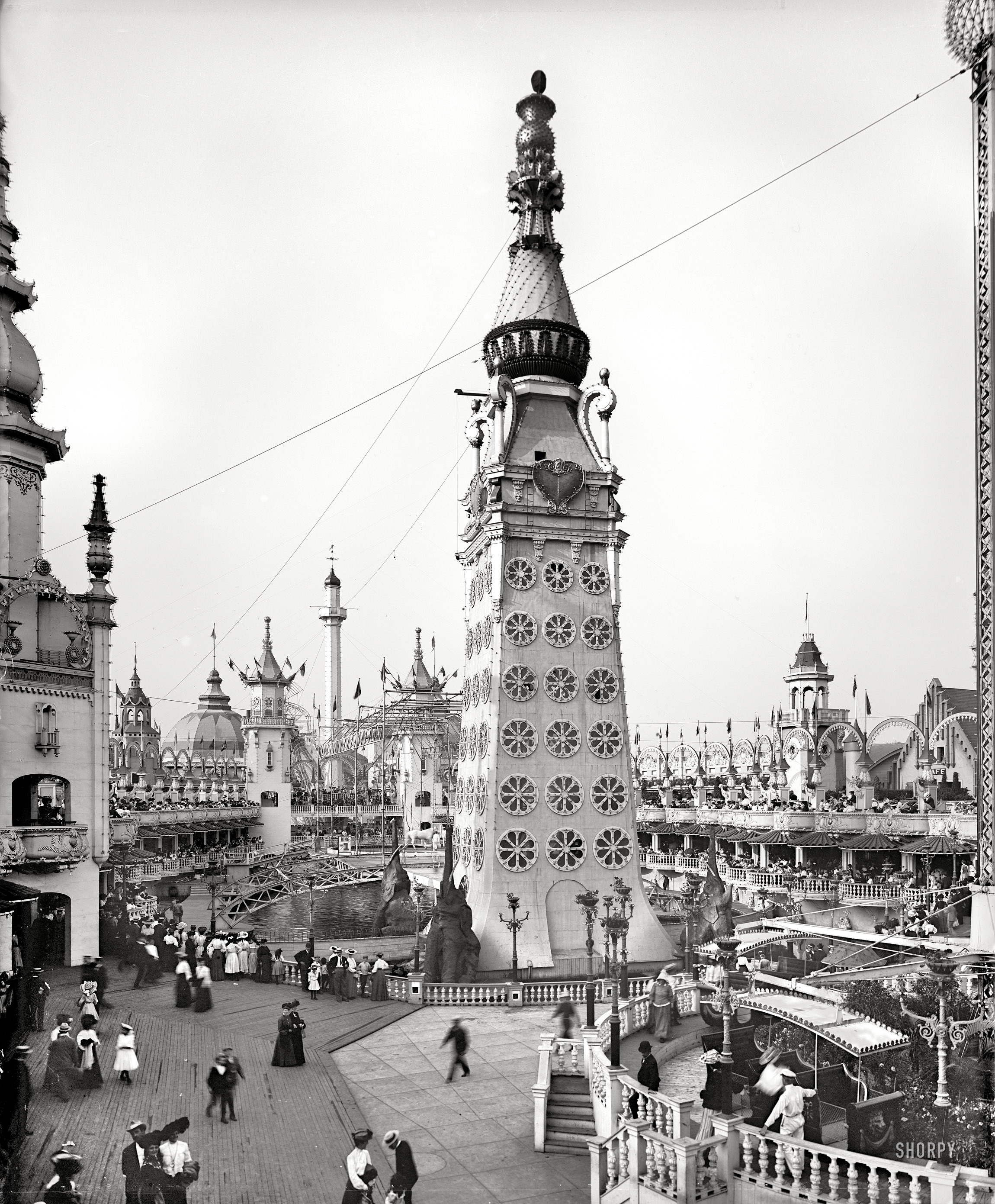
The Trip to the Moon Luna Park, Coney Island ca. 1903

Double page illustration for “Coney - A Trip to Luna Park” depicting the trip to the moon ride in 1904. ©Jeffrey Lindberg
Luna Park was essentially the first “theme park” in history. Fred Thompson’s concepts of building a place that would appeal to the “child in all of us”, creating architecture that was unlike anything seen before, the rides that would allow people to escape for just a few hours, taking a break from the city. This was the fantasy place that I began to write about, where rabbits ran free and the people from the big city were just beginning to come to the shore.

Disney dark ride on the left, unknown “spooky” ride on the right
My fantasy story became about a place that was real, back in the early 20th century. A rabbit became the main character in the story. I was very much aware of the metaphor of the rabbit hole as a place of transformation. Lewis Carroll used it in Alice in Wonderland, and Fred Thompson referred to the “secret door of childhood”, which essentially is the same thing. This must have been in my mind when I imagined a special way for Selena in Coney to enter Luna Park. I created a special door is to be her own private entrance into Luna Park, anytime she wants. And it says, “The Magic Starts Here.”

Concept illustration of secret entrance for Selena the rabbit to enter into Luna Park. ©Jeffrey Lindberg
My Illustration Process - Creating "Coney - A Trip to Luna Park"
Realistic Painting - working with photographs
When I began work on the final illustrations for my picture book, “Coney - A Trip to Luna Park” I had some decisions to make. As a children’s book cover artist, I’ve worked in a very realistic style and in general, I’ve worked professionally in a large variety of styles. What, then, was I going to do for this new picture book?
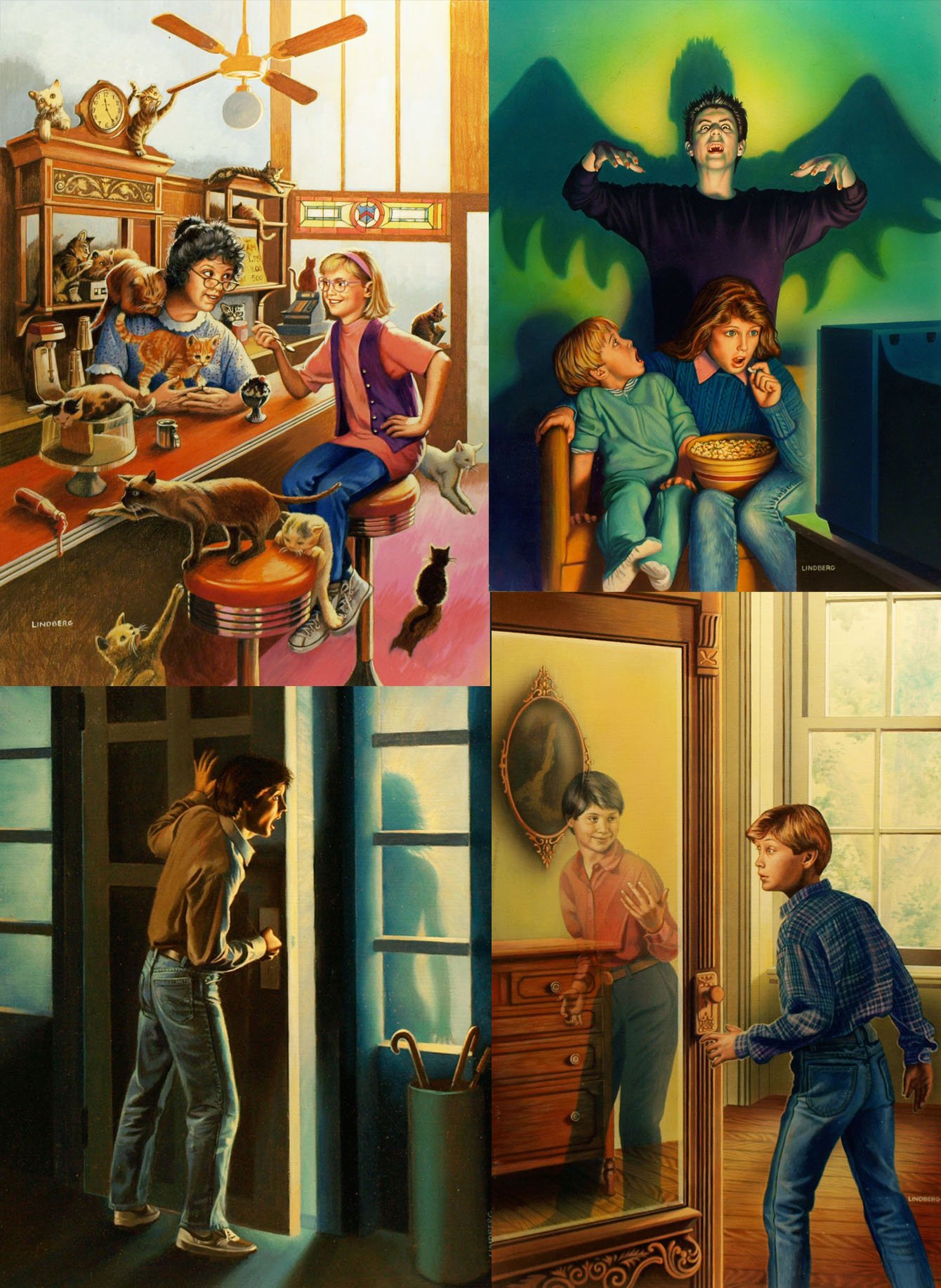
Illustration samples for the young adult children’s book market. See more samples at www.jeffreylindberg.com.
All illustrations ©Jeffrey Lindberg
Editors who worked on young adult mass market paperbacks wanted a very realistic approach to the illustrations, probably because they believed that might help readers to visualize the characters in the story. Most realistic illustrators at that time had photo shoots with live models, a practice harkening all the way back to golden age illustrators like Norman Rockwell.
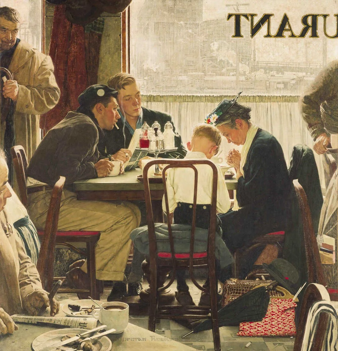
“Saying Grace” Illustration by Norman Rockwell
My illustration process for book covers involved the rough sketch, final sketch, a photo shoot with child models, then prints of the best pictures that I would use as reference. Back then, I was working exclusively with acrylics and oil paints on illustration board. Working with photographs proved trickier than I had thought! At first, I found myself slavishly copying each detail of every photograph, and ended up working too tightly with no expression. I learned how to interpret the photo- and my work improved as a result.

Illustration ©Jeffrey Lindberg
Techniques used in Coney
Those days as a realistic illustrator are a counterpoint to my approach in Coney. Yes, I had long worked with photographs to achieve a level of realism that the YA cover market expected. Should I use photographs for the characters in Coney as well? I took some pictures of 2 of my grandchildren, who were around 10 years old at the time--a perfect age! I used myself as the model for the conductor and engineer. You can see in the example below how that approach would have worked.

“Trolley Trip to Coney Island”. Acrylic and oil on board. Illustration by Jeffrey Lindberg
The realistic working method using photographs is very time-consuming, and I knew that this picture book was going to be at least 32 pages long! (Ended up being 48 pages!)
So I decided to create about 5 double-page spreads in the full painting style. I then would illustrate a majority of Coney using my own style of drawing that comes straight from my imagination. I returned to the media that I used as a beginning children’s book illustrator- pen and ink with watercolors!
Initially I planned on scanning the ink drawings, and then color them using Photoshop. But I wasn’t happy with the results because the digital coloring just looked too, digital. This was going to be a book that visually represented the Coney Island of 1904! I needed a more traditional media for the color.
Watercolors were the perfect solution. The pooling together of the colors using wet in wet technique. The “happy accidents” that always happen with traditional media- color mixing will surprise you, but that’s the beauty of it. So every watercolor painting had to be scanned as a digital file to then be “finished” using Photoshop. Then tweaked the images to clean up the final art- without overdoing it and ruining the fresh qualities of the watercolor on paper.
Working with archival photographs
I began my search for images that depicted how Coney Island looked in 1900. Then I discovered the Library of Congress. The pictures that I found were absolutely amazing! They were so important in helping me to recreate the Coney Island of 1904. Here are some examples of the archival photographs, and how I used them in my illustrations.
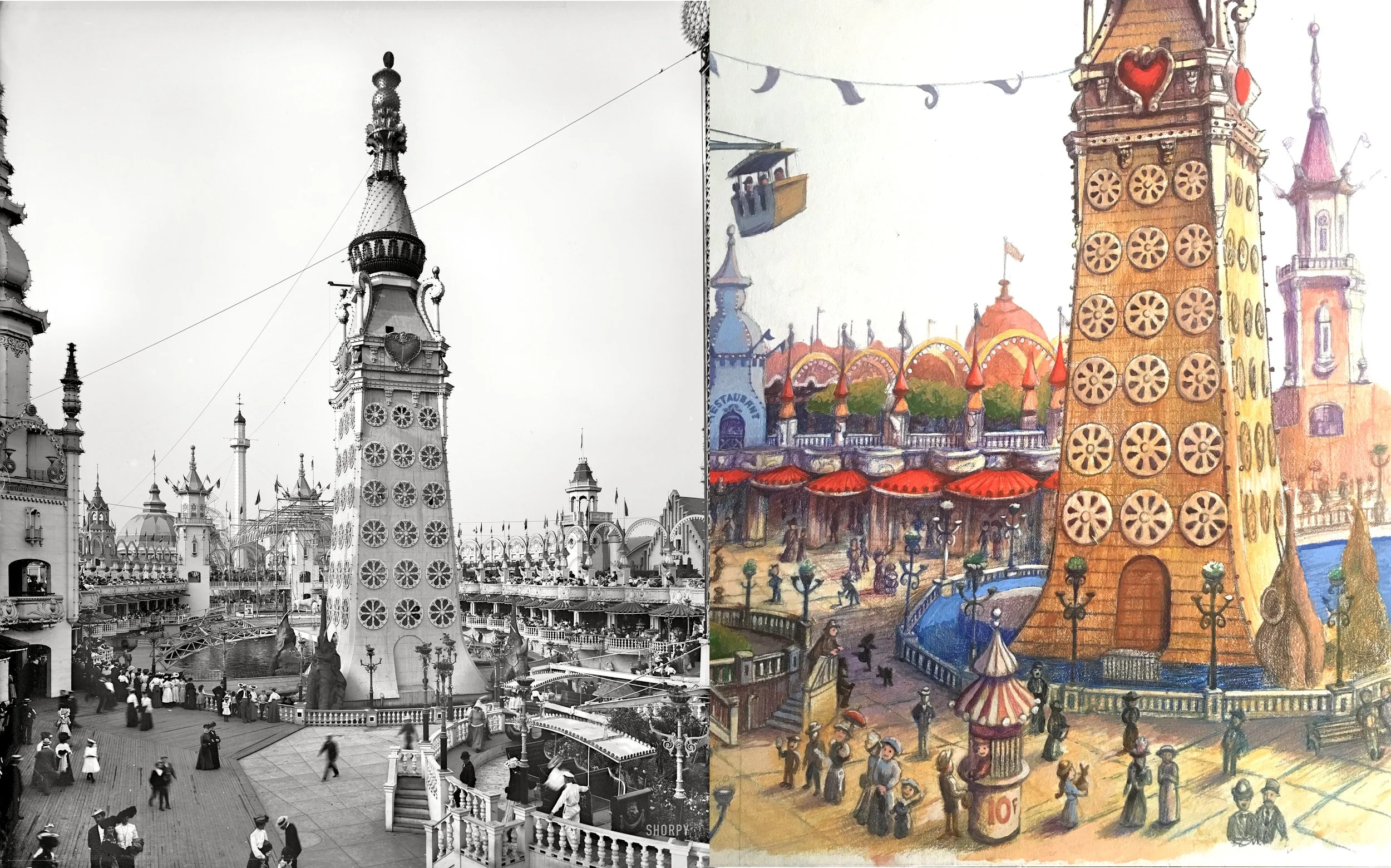
Left: Luna Tower - photograph Library of Congress. Right: Luna Tower illustration in progress. ©Jeffrey Lindberg

Left: Ride in Luna Park- photograph Library of Congress. Right: Illustration using photo reference. ©Jeffrey Lindberg
The detailed images below show my work in progress. In creating the full-color paintings, my process starts with the pencil drawing, then I use colored pencils as a kind of under-painting. Acrylic paints are then used to develop the image further. Each kind of media has its own properties that work to achieve certain results. I have found that acrylic works best for me when I am looking to achieve a more graphic, detailed and realistic result.

Top images illustrations in progress using colored pencils and acrylic paint. Below image close-up of illustration using mixed media colored pencils and paint
The painter Andrew Wyeth is a good example of this approach. Even though he used egg tempera, and not acrylic paint, I believe that these 2 media have similar properties and applications. It’s interesting to note that Andrew Wyeth was also was an amazing watercolor artist, using brushwork that was much more loose and expressive than his egg tempera work. I believe that he used these 2 different media to achieve different purposes in his artistic expression.

Watercolor painting - Andrew Wyeth
Unfinished watercolor painting for Coney - ©Jeffrey Lindberg
Artists use the techniques that they have learned to express something that is inside of them. This could be a story, a moment in time- or simply just something that one feels can only be expressed non-verbally. I have used these techniques to tell my story about the Coney Island of 1904. For those of you who are interested in finding out more about Coney, I am offering a free pdf download of my book directly from my website. Please go to https://drive.google.com/file/d/1vjqcCknToO3E6MsujHTaSMXEiLYZqlFn/view.
When you have read it, please let me know what you think! I love to hear any and all comments. Thank you for your interest.
A Trip to the Moon in Coney Island in 1904
A Trip to the Moon in Coney Island!
Many people are familiar with the Georges Méliès movie “A Trip to the Moon”, especially with that iconic image of a bullet-shaped rocket ship lodged in the eye of the man in the moon. What is lesser known is the Trip to the Moon “dark ride” that was designed by Fred Thompson, who later went on to greater fame as the creator and designer of Luna Park in Coney Island in 1903. The original ride was created to be a part of the Pan-American Exposition of 1901 in Buffalo, New York. It was a great success at the Centennial, and after it ended, Fred Thompson made it part of his newest creation in Coney Island.

Iconic image from A Trip to the Moon by Georges Méliès
The airship Luna resembled a wooden ship with wings, which would flap up and down allowing it to “fly”. It was designed to be moved by unseen hands as a real ship might, tipping and bobbing as it soared into space- destination: Moon! The passengers would be thrilled as they viewed Coney Island below them as the ship rose into the sky. The illusion of movement was achieved with the use of painted backgrounds that would drop slowly alongside the ship, making the audience feel like they were really flying!

Artists illustration from 1904

Illustration by Jeffrey Lindberg from “Coney - A Trip to Luna Park”
When the Luna airship landed on the Moon, they were greeted by costumed “little people”, not unlike the Munchkins of the Wizard of Oz. These people were called Selenites, and depicted “moon people”. After many festivities and performances, the moon travelers would be led to the gift shop!
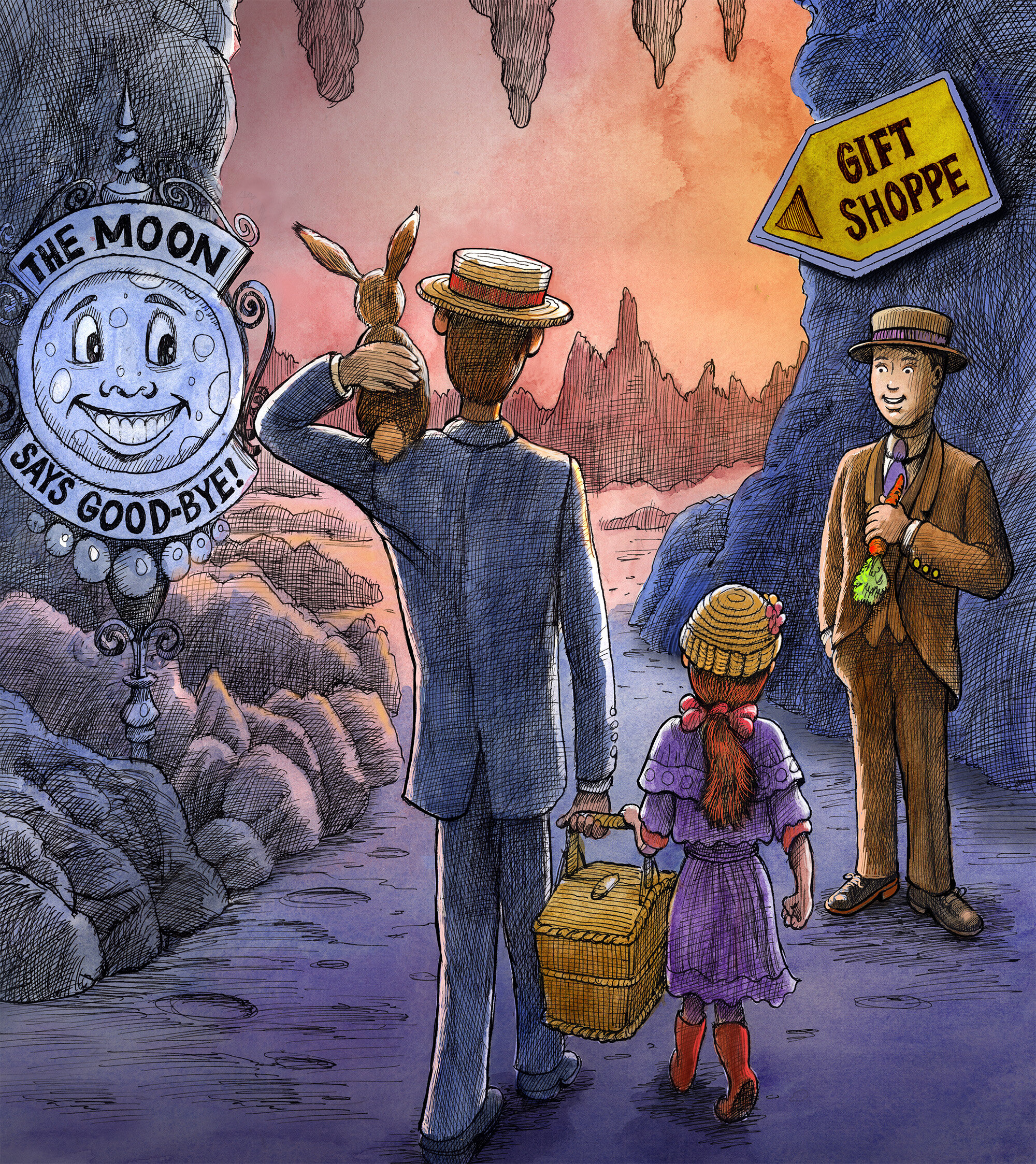
“Leaving the Moon” Illustration from “Coney - A Trip to Luna Park” by Jeffrey Lindberg
Flying was on everyone’s mind at the turn of the century, so this was the perfect ride to have as a centerpiece of the new Luna Park. In my picture book “Coney - a Trip to Luna Park”, I have illustrated the trip to the moon as I think it might have appeared in 1904. When I was doing research for Coney, I found many wonderful images on the Library of Congress website. I found photographs that were so clear and detailed, it was if they had been taken only a few years ago! Finding these pictures was crucial to the look of my illustrations because it was if I could walk right into those pictures of Coney in 1904.

Image of the “Trip to the Moon” in Luna Park ca. 1904. Library of Congress
My visual depiction of the Trip to the Moon was somewhat tricky because there weren’t that many images that I could find of the actual ride. You can see in the images below that the actual airship itself exists only in an artists rendering of what the actual ship looked like. I based my illustrations of the airship on these renderings. There are photos of the building and the entrance to the ride, but as far as I know, no images exist of the inside of the ride, so that part I had to make up. I am an artist, aren’t I? So I used my imagination to depict what I think it might have looked like. It will up to you, the viewers and readers, to let me know if you like how I have imagined it.

Printed brochure from the “Trip to the Moon” ride ca. 1904
Thank you for your interest in Coney island and my depictions in my children’s picture book. I welcome all emails and questions, and look forward to opportunities to educate children and adults about a world that existed in the past that I believe shouldn’t be forgotten. “Coney - a Trip to Luna Park” is available on my website, coneybook.com and on Amazon, in both hardcover and paperback versions.

How Coney Island got its name...
How Coney Island got its name (one theory)
…and how that led to making my picture book “Coney - a Trip to Luna Park.”
Did you know that Coney Island got it’s name from the Dutch word for rabbit? If you check out the Wikipedia site for Coney Island, https://en.wikipedia.org/wiki/Coney_Island, it mentions many theories about the genesis of the name Coney. And for my purposes it really doesn’t matter, because once I read that Coney was named for rabbits, light bulbs began to flash in my brain. I had the story that I wanted to write!
At this time, I was living in Sunset Park, Brooklyn, with my family. I had been working as a cover artist for young adult children’s books. I was working in a style that was very realistic, which was what the art directors and editors wanted to see on their books at that time. I think that it helped the young readers to identify with the characters in the stories.

I illustrated many book covers, and loved the challenge of creating an image that was dynamic, enticing the reader to dive into the story! But I also had the desire to write my own stories and illustrate them. I had toyed with different story ideas and created storyboards to see if I could make them work. But when I found out that Coney was the dutch word for rabbit (even if there are many other theories), I started to wonder.

What would life be like for rabbits living among the dunes of the sea? Who would the predators be? Humans? The indigenous people who lived there? Animals would be for sure. But then I started to think of the amusement parks that would make Coney famous. Places like Steeplechase Park, Luna Park and Dreamland. The rabbits lived there for many, many years. But once the building started on top of their dune homes, how did they cope? Did anyone actually care?
These thoughts led me to doing research on Coney Island. I found many images of Coney Island from the turn of the century in the Library of Congress. These images pulled me in to the past, and the more I looked at them, the more I knew that I wanted to create a book filled with images of the beautiful Luna Park!

Luna Park at night in 1904
It’s my hope that Coney will not only entertain young children and their parents who read it with them, but also serve to illuminate the past in a way that is fun and informative. Thank you for taking the time to read this, and if you have any questions about Coney, my illustration process and just picture books in general- please send me an email at jefflindberg25@gmail.com!